All early maps are printed in black and white: the British Ordnance Survey maps were not printed in colour until as late as the 20th century. The difficulty was to obtain the correct register, that is the exact placing of each individual colour, to avoid either overlapping or a gap between two adjoining colours. In either case the result is most unsatisfactory. In the middle of the 18th century George Baxter perfected a colour printing process using a series of blocks, one for each colour, with the correct register. His method was a closely guarded secret, and he obtained a very high standard of work, probably by destroying any print which was not entirely to his satisfaction. His prints were Victorian sentimental subjects and he was not concerned with maps, but his techniques were handed down, and it was through his inspiration that colour printing began.
Many of the maps published in black and white were subsequently colored by hand and rather more original coloring was carried out than is generally supposed. (It is sometimes thought that such maps have all been colored in recent years.) In many cases it is very difficult, even for an expert, to establish whether or not the coloring of a particular map is old. In the main it is most desirable to acquire maps which are in original color, but some old coloring is very poor, is crudely applied, inappropriate, and garish, carried out with insufficient attention to detail.
Conversely some is really magnificent, with a quality and richness which has not been dulled by the passage of time.


In most cases the colour enhances the map and makes it easier to read, one of the reasons why they were coloured in the first place. Though the colourist had a free hand to colour the map as he
In most cases the color enhances the map and makes it easier to read, one of the reasons why they were colored in the first place. Though the colorist had a free hand to color the map as he wished, there was a kind of formula which was normally followed by the professional. Each colorist mixed his own colors and had his own techniques for their application. Various materials were used as size to prevent the paper absorbing the color too rapidly or unevenly, white of egg being the most common. judging from books on the subject, some colorists went to great lengths to obtain the correct color, the constituents coming from all over the world and taking several days to prepare. These colors are generally remarkably good, retaining their brilliance and showing little sign of fading since they were applied. The greens can cause some trouble: they were made from verdigris which in time rots through the paper to the extent of disintegration. This occurred mainly with the maps which were colored before 1700, and if there is any doubt about the strength of the paper which has been colored in this way, it is advisable to have the paper strengthened from the back, not a difficult operation and one which may save the paper from cracking.
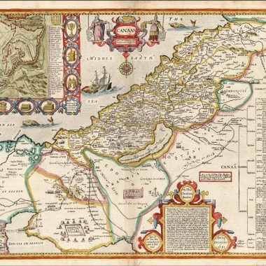
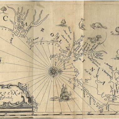
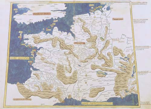
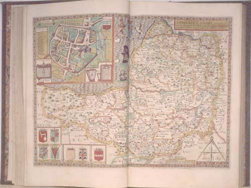
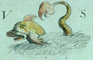
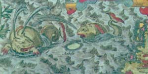
The standard procedure was to begin by coloring in the boundary lines, a different color being applied on either side of the line. Sometimes each division is colored in a pale wash. Estates, parks and woods are colored green, seas and rivers in blue, hills in brown or occasionally in green, and the cities and towns in red. The extra decoration is colored as naturally as possible, animals, humans, shipping and all the things that appear in the cartouches. Sea monsters are usually green, their large mouths colored in red, but this was entirely left to the imagination of the colorist. Mistakes can easily occur. One particular map of the County of Cheshire, famous for its cheeses, shows whole cheeses in the cartouche looking like huge millstones, colored in unappetizing magenta and blue.
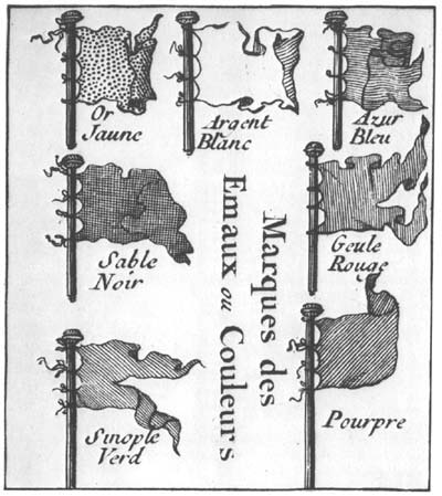
The armorial shields, of course, had to be colored correctly, and this was done by following two simple codes, either by a guiding letter or by a system of engraving the background of the shield. The traditional names for each color are derived from mediaeval French. Gules (red) was marked G, or the engraved lines were vertical. Bleu (blue) was indicated by B, and had the lines engraved horizontally. Sable (black) marked by S, or by lines engraved both horizontally and vertically. Vert (green) was lettered V, or the lines were engraved diagonally from top left to bottom right.
Purpure (purple), an unusual color in heraldry, was lettered P, or had engraved lines crossing from top right to bottom left. Or (gold) is lettered 0 and the engraving is geometrically dotted. Argent (silver) lettered A, is left plain and is not usually colored on old maps. The system worked very well, an easy guide for the professional colorist who knew the code, but not all colorists were professionals and sometimes the armorials are incorrectly colored. The Dutchmen unfortunately reversed red and blue, the two most important colors in heraldry. This would not have mattered had all Dutch maps been colored there but many of them have been colored elsewhere, according to the usual code.
method of systematic engraving as
a guide to the colorist.
Coloring is still being added to maps today, generally speaking with great care and consideration by experienced colorists who know the right coloring for each map-maker. Often their work is preferable to that of the early colorists. Whether this practice is aesthetically right or wrong has been the subject of many long discussions. There are some maps which were not intended to be colored: the Italians thought that coloring obscured the detail and the quality of their engraved work. There are other maps which lend themselves to color, particularly the plainer maps of the 18th century and those which are crowded with detail.
As a rule it is best for the buyer to use his own discretion: the main thing is that he should like the coloring himself. The dealer cannot assist over this, nor can he always state categorically the period at which the coloring was applied.